Case Study

One window for buying, playing and finding your friends

I was Design Lead on Origin, EA's PC store and game launcher, from April 2014 to 2016. I led the core redesign with two designers: one menu and one look across the client, the web and mobile, a rebuilt design system underneath, and friends and chat inside the launcher. It reached players as an opt-in beta in July 2016, ahead of Battlefield 1 and Titanfall 2.

Design LeadApril 2014 – 2016Windows · Mac · origin.comOpt-in beta, July 2016
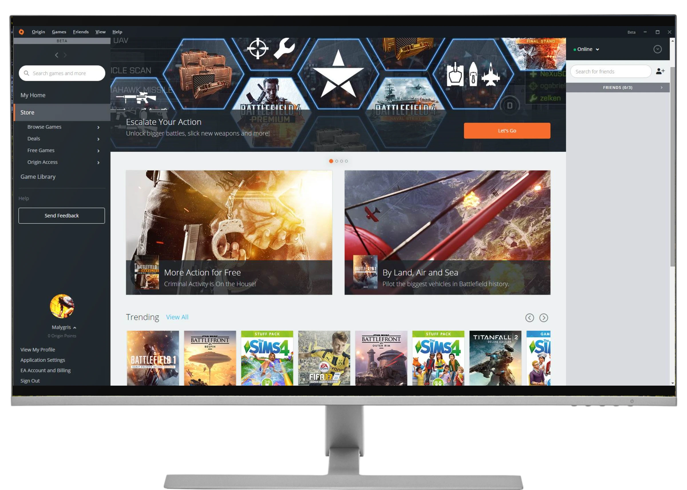
The redesigned Origin client in its July 2016 beta on a desktop monitor: a left menu with search, a Battlefield 1 banner on the store home, featured games, a Trending row and the friends panel on the right
1
2
3
4
5
6
01

Search first. One field at the top of the menu for games, deals and more.

02

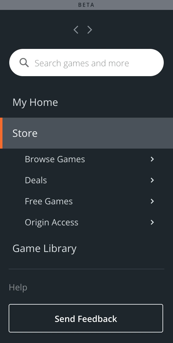
One menu. My Home, the Store and its sections, and Game Library in one list.

03

A home tailored to you. Games, articles, videos and deals based on what you own and play.

04

Trending. What's popular right now, one click from a store you can sort.

05

Friends on the right. Who's online and what they're playing, always in view.

06

Feedback. On every screen of the beta, so players could tell us what they thought.

Role
Design Lead, leading two designers
Product
Origin, EA's PC store and game launcher, on the desktop client and origin.com
Worked with
A producer, a project manager and engineering
Shipped
Opt-in beta in July 2016, three months before Battlefield 1 and Titanfall 2

More ways to get a game, the same two tabs

Origin was where PC players bought EA's games, downloaded them, launched them and found their friends. By the time I joined it had passed 50 million registered users.

It had just started giving games away when I arrived. Within two years it was also lending them for a weekend and renting out a whole library. The client still split everything into My Games and Store, a structure from 2011, and the client, the website and mobile had each grown their own components.

What made it hard
01

Every EA game launched here

A broken update meant players couldn't start games they'd paid for, and the biggest launches of the year were on the calendar.

02

Three surfaces, three libraries

The client, origin.com and mobile had drifted apart: disconnected component libraries, inconsistent type, and animations that had to be rebuilt from scratch.

03

Friends on every platform

Players' friends were on PC, PlayStation and Xbox. Showing them in one place meant components built for one platform had to carry three.

One window for everything a player does on Origin, and it looks and works the same on the client, the web and mobile.

The product vision

When the beta opened, EA described it to players in the same terms: one look “across web, mobile, or in the client,” and “we simplified finding players, games, and extra content.”

2014 – 2016

Two years, three new ways to get a game

I joined in April 2014, a month after Origin started giving games away. Two more ways to get a game followed, and none of them had a natural home in the old client.

Mar 2014 · On the House

Free games

Full games given away for a limited time, starting with Dead Space, the month before I joined.

Jun 2014 · Game Time

Weekend trials

48 hours with a full game, starting with Titanfall. Progress carried over if you bought it.

Jan 2016 · Origin Access

A subscription

A monthly fee for The Vault, a library of EA games, plus 10% off and early trials.

Jul 2016 · Beta

The redesign

One menu with a place for all of it, on the client and on origin.com, opt-in from settings.

The calls that shaped it

Four decisions mattered most. Each one shows where my part sat.

Decision 01 / 04

Make every game easy to find, however you get it

The tension

Free games, weekend trials and a subscription all sat inside the store's own menus. A game opened in a pop-up, and your library was a separate tab.

The call

A menu on the left: My Home, then Store with Browse Games, Deals, Free Games and Origin Access, then Game Library. My Home suggested games, articles and deals based on what you own and play, the store gained sorting, filters and a Trending row, and every game got a full page with its editions and its trial. In the library, each game became a tile carrying its achievements, extra content and settings.

My part

I led this structure from the menu down to the game page, and kept it the same on the client and on origin.com.

What it meant

Origin Access, launched that January, got its own permanent entry, and a deal, a free game or your library was one click away. A day after the beta opened, Hexus led its review with the new left menu and called the store “far less cluttered and easier to browse.”
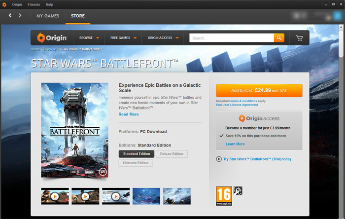
Before: Star Wars Battlefront in the old client's pop-up quick view over the store, with My Games and Store tabs across the top
Before · a pop-up over the store
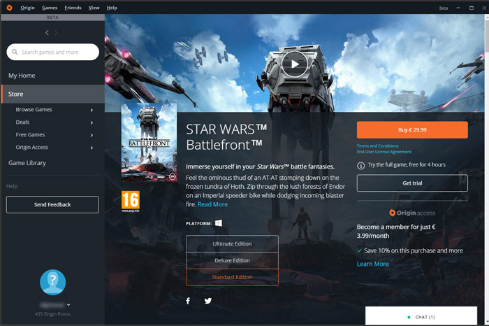
After: Star Wars Battlefront on a full game page with editions, a free trial and an Origin Access offer, beside the new left menu
After · a full game page
The same game in the old client and the beta. Public screenshots, Hexus, 29 July 2016.
Decision 02 / 04

Rebuild the design system before the screens

The tension

The client, origin.com and mobile had grown separate component libraries, with inconsistent type and animations that had to be rebuilt from scratch. A new look painted over that would have drifted apart within a release.

The call

One design system and component library, sized for the new client and shared by the client, the web and mobile.

My part

This was my core contribution. I redid our design system and component library to match the scale of the overhaul, and when PlayStation and Xbox integrations pushed components past what they were built for, I adjusted and redesigned them to carry it.

What it meant

EA could tell players the beta “looks and feels the same across web, mobile, or in the client.”

Navigation menu with search, My Home, Store sections, Game Library and Send Feedback
Navigation
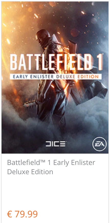
Store game card for Battlefield 1 Early Enlister Deluxe Edition with its price
Game card
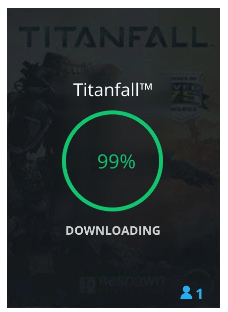
Library tile for Titanfall with a green progress ring at 99 percent, downloading
Tile and progress
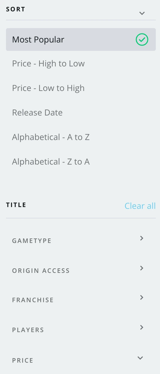
Store sort and filter panel: Most Popular, price, release date, alphabetical, then game type, Origin Access, franchise, players and price
Sort and filter
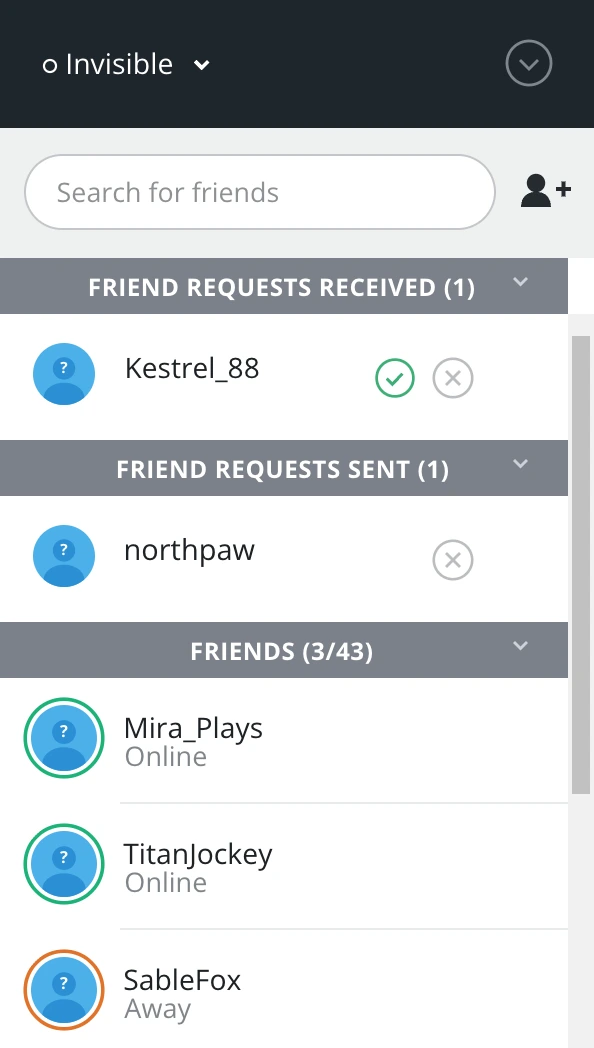
Friends panel with status, friend search, requests received and sent, and the friends list
Friends panel
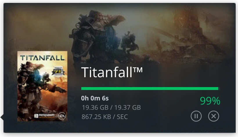
Download card for Titanfall with a progress bar at 99 percent, size, speed, pause and cancel
Download card
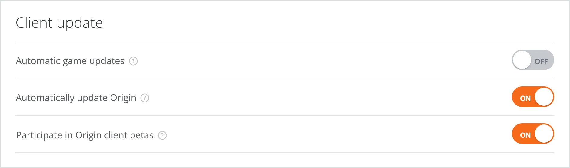
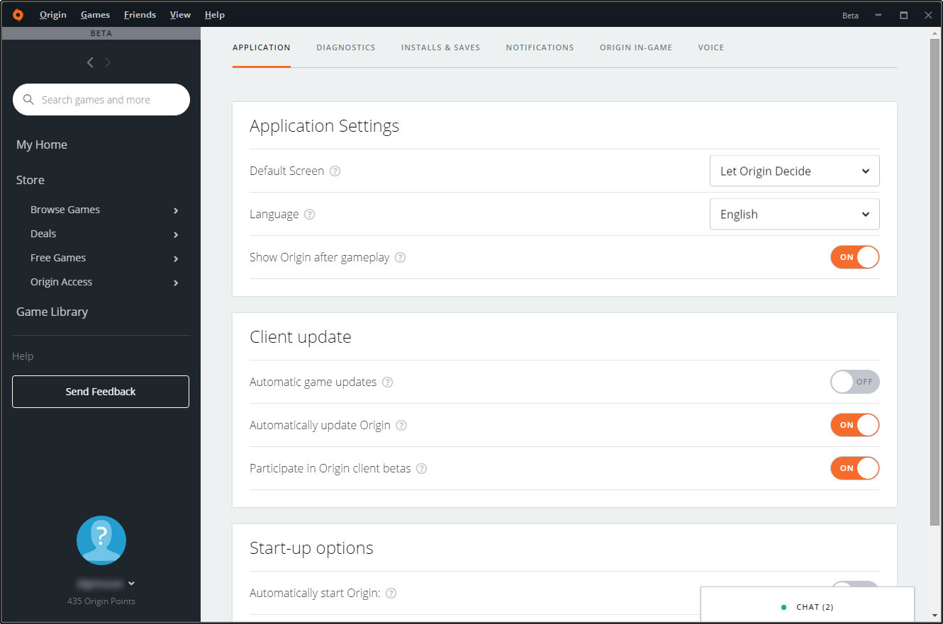
Client update settings with on and off toggles, including Participate in Origin client betas
Settings and toggles
Chat tab docked at the bottom of the window showing two conversations
Chat tab

Parts of the system from the July 2016 beta, redrawn from public screenshots (SimsVIP and Gamewatcher, 28–29 July 2016). The game art comes from those screenshots, and the friend names are placeholders.

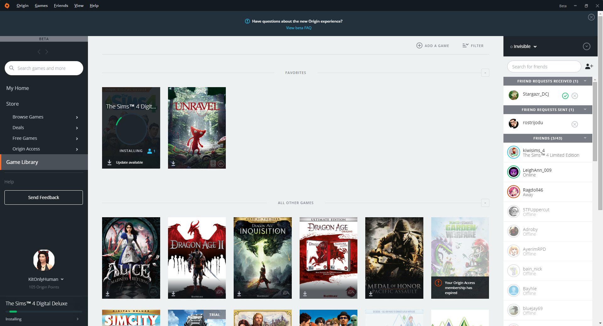
The beta's game library with favorites and all other games, and the friends panel open on the right showing who is online and what they are playing
The beta library with the friends panel open. Public screenshot, SimsVIP, 28 July 2016.
Decision 03 / 04

Bring friends and chat into the launcher

The tension

Players' friends were spread across PC, PlayStation and Xbox, and the old client could already import them from consoles. The new launcher had to keep that while putting friends in view on every screen.

The call

Friends docked on the right of every screen, chat in a tab at the bottom, and each game showing which friends play it.

My part

I designed the integrations and chat features inside the launcher. Connecting PC with PlayStation and Xbox was the hardest part to manage, and it drove the component changes in the system.

What it meant

“You can see when your friends are playing,” PCGamesN wrote the day the beta opened.

Traded away at beta · group chat and importing friends from PSN and Xbox Live, held back for later updates

Decision 04 / 04

Ship it as a beta players chose, before the fall's biggest launches

The tension

Every EA game on PC launched through this client, and Battlefield 1 and Titanfall 2 were due in October. A redesign that broke in launch week would stop people playing games they'd paid for.

The call

Open the beta in July as an opt-in from Application Settings, with Feedback on every screen and published steps to go back to the old client.

My part

With our producer and project manager, I planned the design work around those launch windows. I worked closely with engineering so cross-platform features were tested and working before each release.

What it meant

A 74% positive rating on the redesign's functionality and experience in the beta's first month, with three months still to go before Battlefield 1.

Origin beta Application Settings: default screen, language and client update toggles, including Participate in Origin client betas
Beta settings, with the switch to take part in client betas. Public screenshot, 2016.

Balancing what pulled in different directions

The hardest calls came down to which of two good things to protect.

01

Launch dates vs. stability

Battlefield 1 and Titanfall 2 set dates nobody could move. Opening an opt-in beta in July bought three months of real use, with a way back, before those launches leaned on the client.

02

One system vs. three platforms

A shared component library kept the client, the web and mobile consistent, but PlayStation and Xbox integrations pushed it past what it was built for. I adjusted and redesigned components so one system could carry them.

03

A new look vs. every old feature

The beta shipped without group chat or PSN and Xbox friend import. We told players plainly what was missing and how to go back, instead of holding the whole redesign for them.

Who did what

Origin was a big team effort. Here's where my work started and stopped.

What I owned

The core redesign of the client, the design system and component library underneath it, and the integrations and chat features inside the launcher.

Who I led

Two designers who carried the redesign across screens and platforms with me.

Who I worked with

A producer and a project manager who set our work against the launch windows for Battlefield 1 and Titanfall 2, and engineering, who built alongside us and tested the cross-platform features with us.

I inherited a team that wasn't yet aligned on a shared product vision, so I started with design jams, journey-mapping workshops and exercises that helped us lean on each other's strengths. Every redesign went through usability testing before production, and alpha and beta feedback kept us honest.

What shipped, and what the beta told us

The redesign reached players as an opt-in beta in July 2016: one menu, one system across the client, the web and mobile, and friends inside the launcher.

74%
Positive rating, first beta month
On the redesign's functionality and experience.
50M+
Registered users to bring along
Origin's audience by 2013.
3
Surfaces, one look
The client, origin.com and mobile, in EA's own words.
2
Designers I led
Alongside a producer, a project manager and engineering.

The redesigned client became Origin's standard look and stayed until EA replaced Origin with the EA app in 2022. Origin itself was retired in April 2025.

What the beta taught us

The 74% told us the structure was landing: one menu, friends in view, a store you could sort. Because the beta was opt-in, the first verdicts came from players who chose to try it, in their own words, with time left before the fall launches. And the features we'd held back, group chat and PlayStation and Xbox friend import, were the gaps we still had to close.

Looking back

The system was the product. Players saw a new menu and a darker left rail. What made it hold across the client, the web and mobile was the component library underneath, and I'd make that case to leadership earlier and louder.

Integrations need their own timeline. PlayStation and Xbox friends were the hardest part, and they didn't make the first beta. Today I'd scope them as a separate release from the start instead of letting them ride with the redesign.

Big changes land better as a choice. An opt-in beta with a way back let players meet the redesign on their own terms, and it's how I'd still introduce a change this size to an audience this attached to its habits.